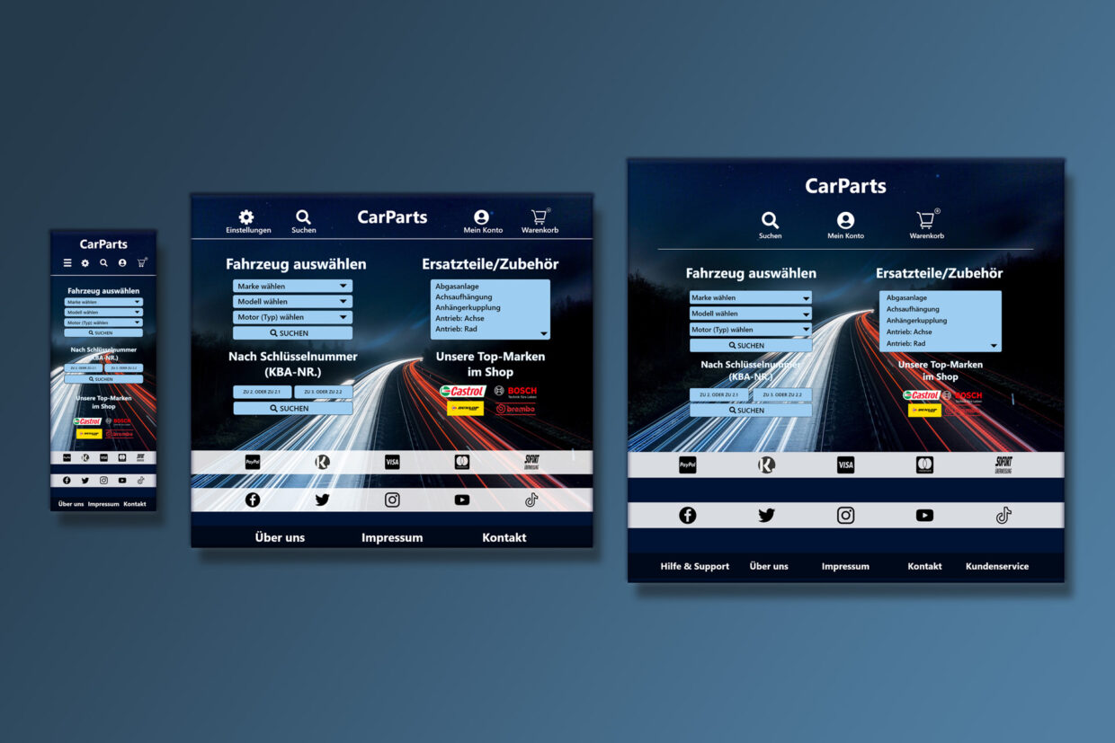
For this fictitious user interface I made myself a challenge and tried to make an interface without any user flows or other pre design preparations. The goal was to start in front of a white template in Adobe Xd and get a responsive shop/app interface with a few screens.
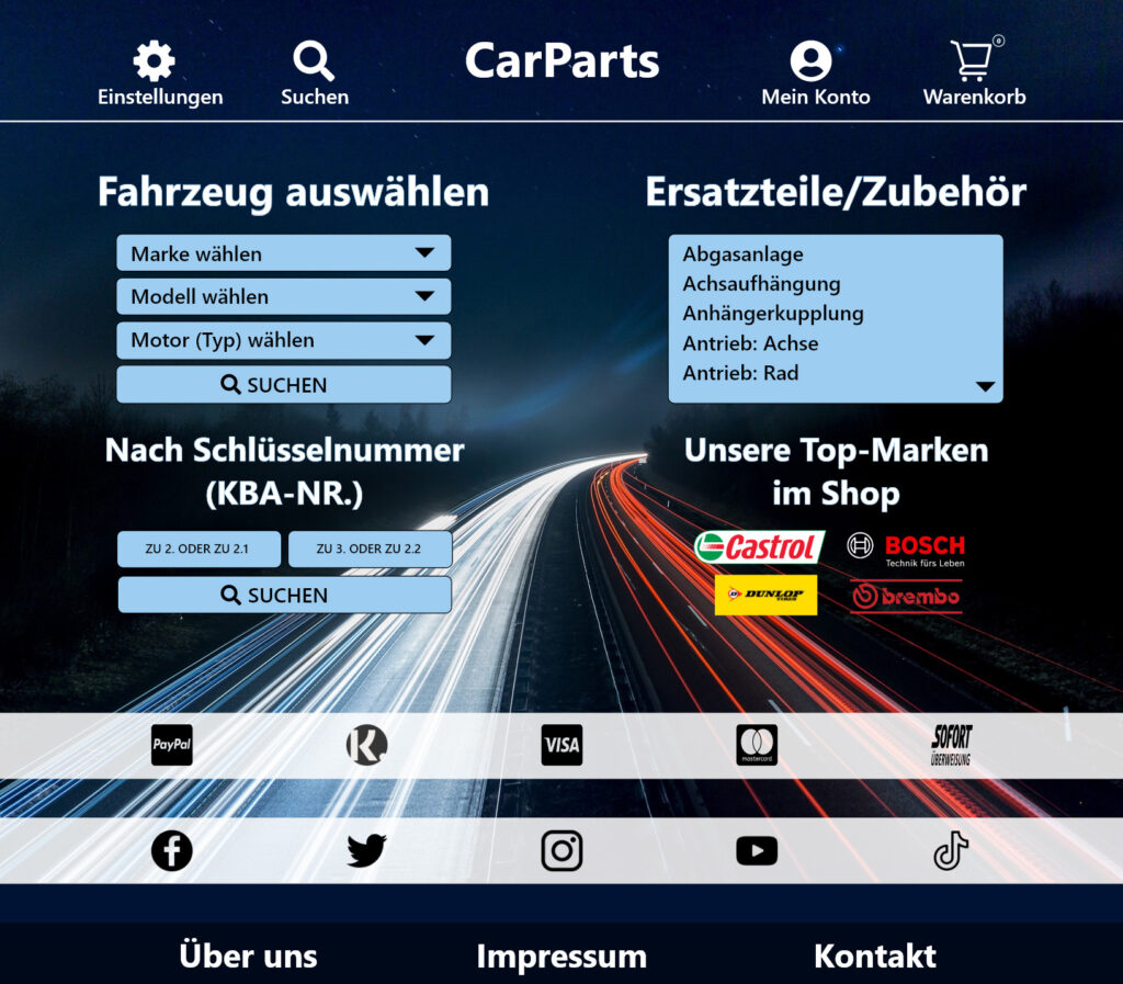
The mobile view can be tested and contains two more screens. The tablet and desktop view are demonstrating how the responsive design can look like.
Created in 2022©
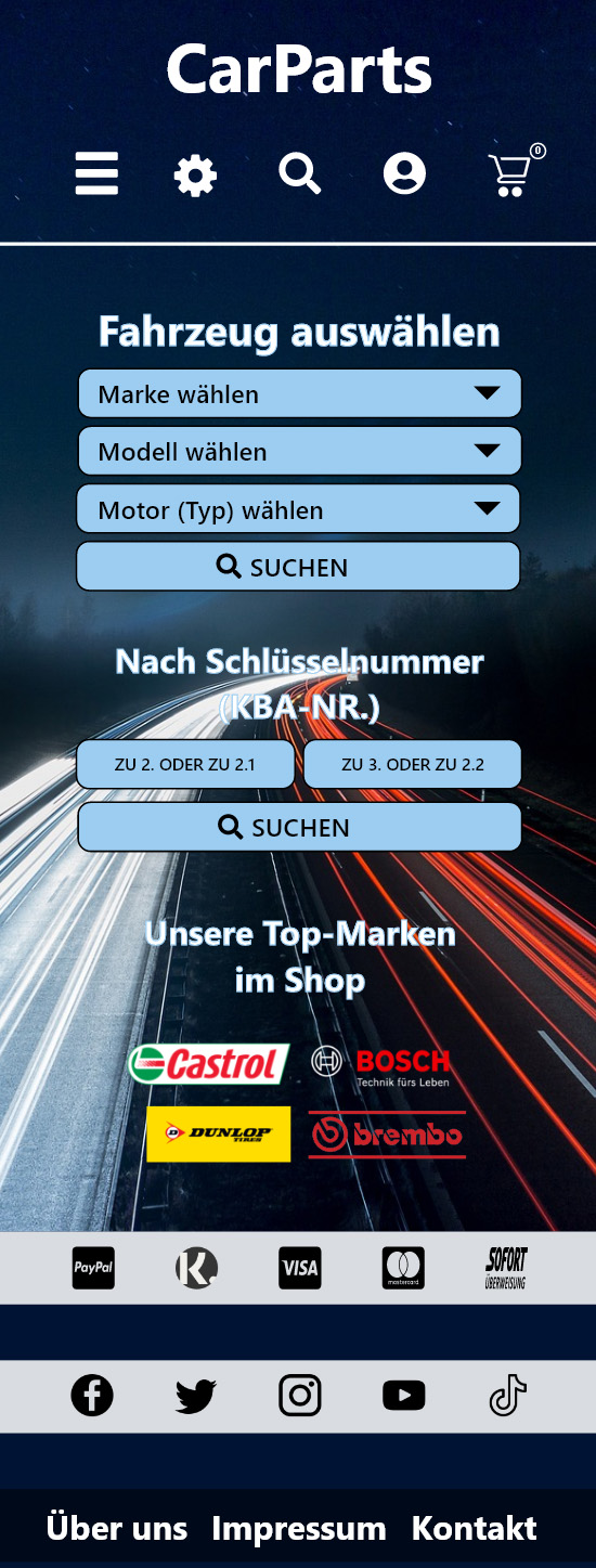
Mobile view with two more screens that can be tested with the button below:
The tablet screen to demonstrate the responsive design.
For a better view, click on the button below:
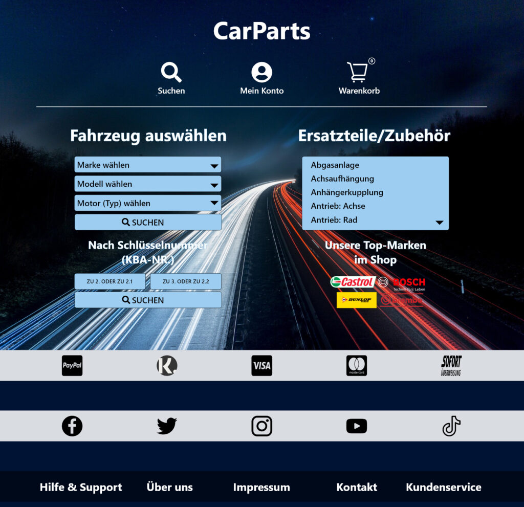
The last screen contains the desktop design.
For a better view, click on the button below: